|
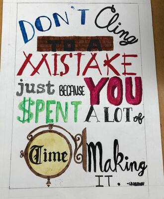
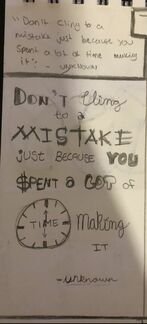
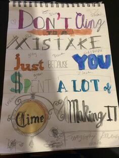
Typography Project - Kolesa This project consisted of a quote or saying and a variety of different texts. For this project, I decided to draw a quote I saw on an Instagram story of one of my favorite band members account. I really liked this quote because I think everyone should apply it to their lives. It shows you how the small things you thought were important at one point won’t matter hanging on to. So move on rather than dwelling on the past, which will be irrelevant as soon as it passes. At first I wasn’t sure who said this. But after some research, Aubrey de Grey is the one who said it. he is an English author and a biomedical gerontologist. He studied the biological process of aging, which now makes sense on why his quote has to do with time and not wasting it. He probably mentioned this statement in a book with him being an author so it relates to both his fields of work. Now back to the art, I used some different ways of emphasis to make the words I thought were important stand out. The bright colored words are associated with the important words and it’s overall message. There is also a variety of texts and fonts present to tie in the actual idea of typography and also to keep the audience engaged in the piece. Also there are forms of contrast present, because of the not as important words having a muted tone compared to the bright tones. One of my favorite parts of this piece is the vintage clock and font at the bottom, and also the message of this quote. The most important things I feel like I could’ve done better on was the neatness of the whole thing, and also maybe had a theme of the bright colors instead of them being all over the place. But I don’t think this is my best work, it’s still pretty different.
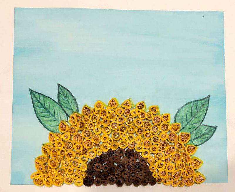
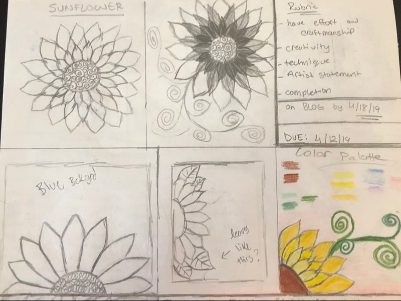
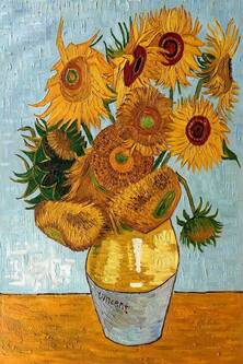
Open Theme Project - Kolesa For this open theme project, I wanted to do something more colorful and fun. So, I decided to go with a sunflower. It’s just a really pretty flower and it’s always fascinated me with how it moves along with the sun rays. So, to do this piece I decided to portray it using the quilling method. I’ve done it once before and it’s end result was really cool so I wanted to do it again. On the paper, I first painted the background using watercolor with a light blue to make the actual flower pop more and it can also portray the sky. Next, there is the actual sunflower but only a half of it because I liked that composition more. Lastly as a finishing touch, I added leaves in there to have another color on paper. I think the best principle of design that could describe this piece is balance. Mainly because of the balance of the bright colors and also the use of positive and negative space. It just all looks very put together and proportionate. I liked the composition of only half a sunflower better due to it still have space to show off the blue background. The master artist that inspired me to do a sunflower related piece was Van Gogh, his painting of the sunflowers in the vase remind one of a fun summer day. And I wanted my piece to give off a similar feeling. I think I could grow more on the time management of this piece because it took a lot longer than I anticipated. Also, the neatness of the whole arrangement could have been better. I personally really like how it came out, especially the whole color palette of it all.
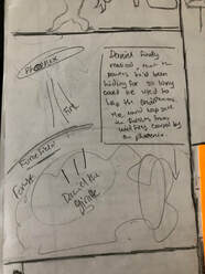
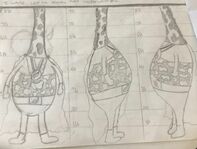
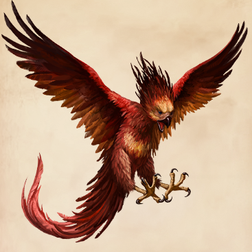
Visual Narrative Project - Kolesa For my visual narrative, I decided to do a superhero story. My main audience would be mainly kids, since it is a form of comic. In this drawing, there are two animals a giraffe and a phoenix. The Giraffe is a superhero in a very green supersuit. The Phoenix is blowing fire at the giraffe. There is also a forest which is being protected by a blue forcefield. There is a form of contrast present. The cool tones of greens and blue against the warm tones of reds and oranges. There is also forms of emphasis present in each element of the drawing. The emphasis can be on the text in the corner due to the bright yellow background, which catches the eye of people but especially children. There is variety in the style of drawing. As in there are some realistic elements and some cartoonish elements. The composition for this piece was half and half. because the 'forcefield' is supposed to split it in half of the fire and the forest. Also the way they are positioned shows that they are in the middle of an action scene. There is a giraffe whose name is Daniel, and he has superpowers. His powers were given to him to help save the environment and help the world be a better place. His enemy is a fire Phoenix who is trying to burn down the forest to get rid of all the trees. I think I could have improved in properly drawing the forests and foliage in the background and maybe add details in the sky. The one thing I really like is that the shading on the Phoenix and also the whole way the super suit for the giraffe is put together. 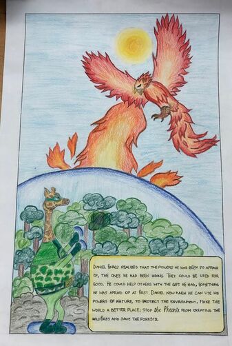 Final Image
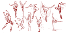
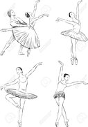
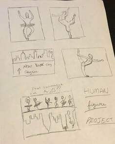
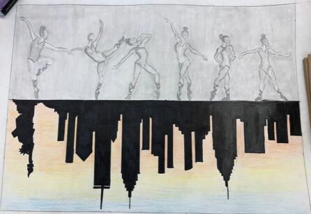
Human Figure Project - Kolesa For this project, I decided to do dancers, or more specifically some form of ballerinas. It is a drawing with dancers in different positions above the horizon line. Below the horizon line, there is a New York City skyline that is somewhat of a reflection like feature because its upside down. The dancers are all done in graphite. The city skyline itself is drawn in with marker and the background of it is a sunset which is done in color pencil. One of the major principles of designs presented in this is contrast, because the contrast of colors is very well present. Also the solid lines of the skyline versus the delicate lines of the dancers' figures. The second principal of design that is present is the balance between the two different parts of the piece. The division at the horizon shows well thought out balance of space for each aspect of the drawing. Lastly, the movement of the dancing human figures is well represented. One can clearly tell that they are dancing and moving in different ways. It makes the eyes move from one side to another. I landed on this idea of dancers and New York because from many sources such as shows and observation, I've learned that NYC is the center of art. I just thought that because that city fosters the thriving talents of ballet, it might be fun to show that on paper. The meaning of this artwork is that even behind such a rush filled city, there is delicate talent hidden beneath it. Some of the things i did right are that I well-represented my idea on paper, I like the way I shaded the backgrounds in each half. I also like the whole concept of 50-50 from the horizon line. The things I could work on more is the shading and drawing of the actual figures, I think I could've drawn them a lot better.
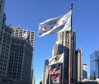
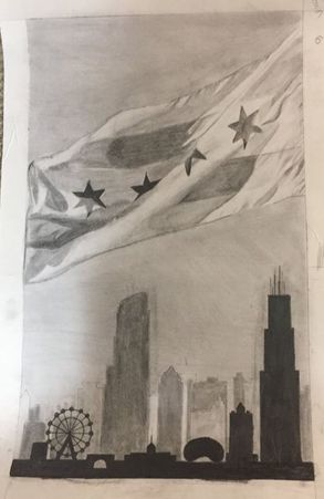
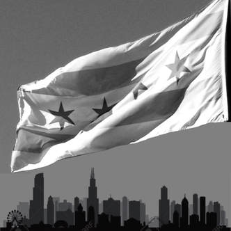
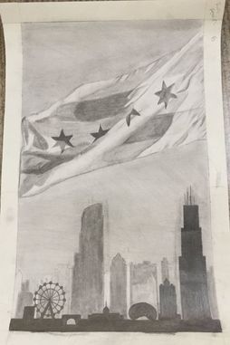
 Final Piece Value Project - Kolesa This project is supposed to be in full value. My subject for this was, Chicago. Its the city I've lived in for the past five years and I just loved it there. So for this project I thought, I want to do something related to the city. I found pictures I took of the flag when I was on the bridge over the Chicago River. This picture really shows the different values of the lights and darks. As I started drawing I realized there is a lot of negative space along the bottom of the page; so I had the idea to add a partial Chicago skyline along the bottom to really put the emphasis on the flag and distract from any negative space.
My inspiration for this piece came from the modern artist, Pierre-Yves Riveau, also known as PEZ. His art is just really magnificent, the way he has the realistic part of the drawing yet also has an interesting twist to it. His style of the tattoo-graffiti type drawings are very fascinating to me because he always has some form of satire in each drawing. Another inspiration is the master artist, Vincent van Gogh. I really admire his style of the landscape drawings and the way he draws the details, The value scale in his drawings are really beautiful and show a lot of detail.
|